Mojo magazine:
The target audience of Mojo, again people interested in music. The magazine is better suited to older adults aged 30-40. This is because the magazine isn't primarily focused on modern day, recent music therefore the audience wouldn't be younger teenagers.
Similarly to Guitar Technique the contents page is featured over 2 pages. The first page only includes one main image. The image is large and stands out amongst the text. The second page has more bold, bright images which are largely relevant to the magazine.
As the pictures are of new Cd's and albums that are coming out they are labelled with the CD name and artists. Towards the bottom of the page are pictures of people who have reviewed the Cd's and are giving their opinion of the CD. Some of the language is humorous and opinionated. Flattery is also used to make the album's look good and make people want to purchase them.
The number of pages in the magazine are 146 and number of articles on the contents page is 20. In contrast to the magazine Guitar Technique, that I previously analysed, you get your moneys worth as there are more articles in the magazine. The magazine costs £4.50. The magazine and price are linked as the magazine includes a free CD.
The page background is white however the text used stands out as it is red and black. The font used is clear and suggestive of the magazine as it is appropriate and the featured colours are sophisticated to suit the target audience.
From studying Mojo magazine I have been able to understand the use of graphics in the magazine and there relevance to the individual pages and overall magazine. The images play a largely important role as they act as text-breakers giving the reader a chance to break from the text and look at the images on the page.
Tuesday, 29 November 2011
Looking at contents pages
Guitar Technique:
The magazine name is Guitar Technique, the target audience is people who are interested in music and in particular people who play the guitar. The magazine has a sophisticated approach therefore the magazine is targeted at an older audience, people aged 30 and over.
The contents page covers two single pages. The proportion of pictures to text is reasonably equal. There is slightly more text on the page which continues the theme of sophistication.
The pictures are individually labelled with the page number they are on and what the picture is of/ who, this allows the audience a greater understanding of the featured articles, genre of the magazine and people in the magazine.
Altogether there are 98 pages in the magazine and 21 magazine articles on the contents page.
The cost of the magazine is £4.99. This may sound expensive for a magazine however a free CD is entitled, therefore you are getting your moneys worth. Some of the article titles give more information than others, the 'Special Feature' articles include a few lines to allow the reader more information about the articles.
The contents page is dominated by a white background, the font colour is black and some text is positioned on to a pale green text book. In this case the test is white.
The target audience is suited to the font as it is plain and clear. This indicates that the magazine is straight to the point and only has one relevance, informing people about music and guitars.
From looking at Guitar Technique magazine and it's contents page I have learnt that even though the price may be more expensive than other magazines you do get a free CD included, therefore my own magazine could include a similar feature.
The contents page doesn't have to be as crowded as the front cover however each article title could include a brief paragraph of what the article is about or contains. These fetaures I have pin-pointed could be used in my own music magazine.
Tuesday, 15 November 2011


Q music magazine

I used the grid method to note down the conventions and different aspects of Q magazine. I was then able to compare the music magazines I studied. 


Final front cover and contents page
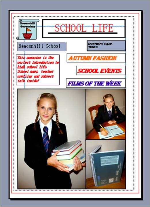
My final front cover and contents page have largely changed and developed from my original designs and ideas, however I now feel my work is suitable for the target audience and shows clear features and conventions of a school magazine.


Overall conclusion of preliminary task
My media preliminary task uses conventions of real media products as it features a masthead, images, text, issue number and featured articles. I don't think my media piece challenges conventions of real media as it sticks to the basic features of a school magazine and doesn't use any additional individual features.
My media piece presents particular social groups as the language used, colours and font style are all appropriate to the target audience of students. The colours are bright and attract a younger audience which is relevant to a school magazine. The use of images relating to the students and school also present the social group.
The media institution of school magazines may distribute my media product as it shows clear conventions of a school magazine. My product also has an individual twist on ordinary, boring school magazines. I feel my product successfully interacts with the reader and the appearance of the magazine engages the audience wanting them to continue reading.
I addressed my audience by including key information about school and made my magazine appropriate to a school regime/ events. This addressed the audience as the reader would be able to relate to the magazine and be persuaded to read it.
From the process of constructing this magazine I have learnt that photoshop is a brilliant software to edit pictures and make them look more attractive and stand out among the text. I think editing pictures is a key concept to make my magazine look professional and increase the quality of the individual images. From the construction of my School magazine I have also learnt that each concept of the magazine e.g the front cover and contents page look the same. This makes the magazine look more professional and creates continuity through out the style.
I have also gained skills in constructing a magazine layout and experimenting with various fonts and text that is appropriate to the magazine genre.


Analysing Music magazines front covers: NME
After finishing my preliminary task we started to study current music magazines. As a class we discussed the various features and looked at how we could imitate these convetions in our future work.
One of the first music magazines I analysed was NME, the cover being shown below.
 As previously I used the grid form of writing my notes, I decided to repeat this method.

One of the first music magazines I analysed was NME, the cover being shown below.


Changes to my contents page.

I decided to use a bubble type font as it would attract the target audience to read the information on the contents page rather than scanning over it and focusing mainly on the images.
The pictures have also been rearranged and picture captions have been added to give the reader an insight to the magazine content. The addition of the images of the snake, dice and ’24 circle’ also give the magazine a younger feel and therefore would again attract the target audience as the magazine has a fun and young feel to it.
The pictures have also been rearranged and picture captions have been added to give the reader an insight to the magazine content. The addition of the images of the snake, dice and ’24 circle’ also give the magazine a younger feel and therefore would again attract the target audience as the magazine has a fun and young feel to it.
Continued changes I have made to my school magazine.

Making Changes to my magazine

With my original contents page I had continued the colour scheme from the front cover using a dull grey background and contrasting font colours like bright red, blue and black. This made the text look more attractive and therefore interest the reader to read the text.


Preliminary task: Editing pictures using Photoshop


The first picture I used had a background that made the colour of the main object (the student) stand out more. However I decided to cut around the image as it had a better effect on the magazine cover and I would be able to add features around the main picture.
To proceed with the editing of the images I used Photoshop. Even though I was unfamiliar with the program it was interesting to play around and gain a brief understanding of the specific tools.
Front cover and contents page- Initial ideas/ First draft
I have decided to use publisher to create my school magazine and to edit my pictures I will use Photoshop. I have chosen to use publisher as I am familiar with it and feel it would be a good program to use to play around with the different features and colours etc.
These two screen shots show my original ideas for my front cover and contents page. I decided to use a plain white background to make the colours of the text and image stand out.
By practicing on these programs I will have a developed knowledge for my future AS media work. The basic understanding of Photoshop will play an important role especially in the editing of my pictures for my music magazine.
I will be able to increase the presentation and quality of my photos which will help me to get an improved grade on my work.

Preliminary Exercise
Task: Create the front page and contents page of a new school magazine.
I have made a bullet pointed list of the brief requirements of my school magazine and what I am considering using on my front cover. I have also noted my first ideas for the audience of my magazine.
Key decisions/ first ideas
•Audience: Younger pupils age 11 ( Year 7)
•Produced once a term.
•Catchy name
•Interesting pictures/ relevant images
•Bright colours
•Logo
•Events and articles
Analysing the cover of a school magazine
•Ruislip eye Target audience: students aged 11-16

•The photos are of a decent quality. This could be improved to make the magazine look more professional. There is one main image on the cover which is surrounded by other various images of medium size. The main image has been used to highlight the magazines main article. Cropping of the photos: The photos are cropped to signify main detail. The photos are also cropped to draw the attention of the audience to the main focus of the image. This would help to engage the target audience.
•Nearly all of the photos relate to one specific article in the magazine. This has been done to show the audience the main story dominates the content of the magazine. The size of the cover lines are fairly small in terms of a typical magazine. They could be enlarged to draw in more attention. There is also only one main cover line which is in the middle of the cover. It is on a white background and the font is black. This means it stands out to the audience.
•The cover does feature some of the typical conventions of a magazine. Ruislip eye uses images, a logo, title and cover lines. This allows the audience to recognise its a magazine. However the magazine doesn't have a striking cover with bold colours. This may show it is a slightly more formal magazine.
•The main images on the cover all relate to one article. However the article is fairly small considering the emphasis of the images on the front cover. This means the article doesn’t live up to the expectations.
•The name of the magazine is wordplay. As the magazine is about the school Ruislip High the title is the Ruislip Eye. This is suitable as it is easy for the target audience to understand. It also is a form of humour which may attract the audience as they see the magazine is informal.
•The magazine also includes other graphics such as the hand drawn logo which is of a student. This relates to the theme of the magazine, school.
•There are no other symbols, captions or key words. The overall message of the magazine is that the magazine talks about fun issues related to school in a less serious and formal way.
•
From analysing 'Ruislip Eye' I have gained knowledge and understanding of the required features of a school magazine. This will help me to produce my preliminary task which is to create a front cover and contents page for a school magazine as I am now able to differentiate between magazines and there genres.
From analysing 'Ruislip Eye' I have gained knowledge and understanding of the required features of a school magazine. This will help me to produce my preliminary task which is to create a front cover and contents page for a school magazine as I am now able to differentiate between magazines and there genres.
Features of a school magazine
•
As we moved away from analysing front covers of different magazines, we were introduced to our next task, the preliminary task. Firstly we had to look at the key features in a school magazine, what stood out and made it clear to the audience it was suited to students. Here is a list of main conventions of a school magazine:
Examples of student work
•School related images
•Logo
•The volume issue
•Headlines
•Contents page
•Text
•School colours or a set colour scheme
•Personal stories or experiences
•Events coming up
•Articles or reports on recent events
•Pictures of things that have been happening in the school
•Informal, humorous language, appropriate for a younger audience
•Pictures: words ratio is fairly equal
•Word play
•Editors message
•Jokes
•Seasonal adjustments
•
Regular features
By looking more closely at the required features of a school magazine, I have looked in greater depth at the main conventions of a music magazine. I was able to signpost the similarities and differences between those of a school magazine and a music magazine.
Typically all magazines do have some similar conventions however those magazines in varied genres do require different elements.
Analysing the front cover of contrasting magazines.
From my studies I can see that magazines vary in many different ways. When a magazine wants to give the reader a certain impression of its genre and inside content the front cover is the main feature the publishers get their message across.
I looked at two magazines with different target audiences, topics and purposes and analysed their front covers, to do this I used a grid method provided by the teacher. The grid made my work look neat and presentable I could analyse specific features of the magazine in more detail.


I looked at two magazines with different target audiences, topics and purposes and analysed their front covers, to do this I used a grid method provided by the teacher. The grid made my work look neat and presentable I could analyse specific features of the magazine in more detail.

 |
| NewScientist magazine and analysis grid. |
 |
| Closer magazine and analysis grid. |

Analysing magazine names
What is the meaning of the following titles?
Before this task I never took notice of magazine titles, however after comparing a variety of magazines I started to notice that the title can present a meaning to the magazine and give the audience a greater understand of the magazine and its content. From studying the names of the magazines, I have realised the importance of the title and recognised that when I start to draft my music magazine I want my title to have an under-laid meaning and show relevance to my magazine and its genre.
Hello! - This name could indicate that the magazine is a gossip magazine. It uses informal chatty language. The use of ‘hello’ could also be a mockery of when people look at something and think ‘oh hello what is this’. This could relate to the magazine being commonly on celebrities or current news showing that when people see the magazine with a cover focusing on celebrities they pick up the magazine and take a closer look into the photos or cover lines.
Hello! - This name could indicate that the magazine is a gossip magazine. It uses informal chatty language. The use of ‘hello’ could also be a mockery of when people look at something and think ‘oh hello what is this’. This could relate to the magazine being commonly on celebrities or current news showing that when people see the magazine with a cover focusing on celebrities they pick up the magazine and take a closer look into the photos or cover lines.
Closer- Closer is also a magazine that focuses on celebrity gossip. Naming the magazine closer has a large effect on the audience as then then feel then are getting closer to celebrity news or gossip.
Heat – is a magazine that talks about the celebrities. The name heat also represents hot which could indicate that the graphology and articles in the magazine are hot gossip.
NME - is a magazine that features current news on celebrities. NME is also quick and easy to say therefore shows it is new express gossip about music. NME also sounds like enemy which could enable the audience to realise that the magazine features competition in the music industry.
Physchologies – a magazine that focuses on the mind and body. The name says it all.
Subscribe to:
Posts (Atom)