

Codes and Conventions of a contents page
Victoria Perry
Victoria Perry
The four contents pages can be analysed by looking at individual codes and conventions these include the pictures, writing and general organisation of the page. Looking at ‘Top of the Pops’, ‘Mojo’, ‘NME’ and ‘mixmag’ all of the magazines use these features in different ways.
The magazines all use a different number of pictures. With Mojo magazine, the contents page is dominated by one main image on the right hand side. The image is in black and white which could represent the magazine relates to modern day bands but also bands from the past. The black and white enhances this message. The camera angle used is a mid shot this allows the reader to notice the guitar in the icon’s hand, again highlighting to the audience the magazine is of a music genre. However, compared to Mojo, NME magazine uses 8 images on a single page. All of the images vary in camera angle and the use of lighting differs. Close up’s are used to show the artist in the pictures facial expressions in more detail. Mid shots and low angle shots are also used for the left hand side pictures which are taken at a concert. Some pictures are styled and arranged and then the image is taken however the darker pictures look as if they are from a concert therefore aren’t staged and are natural. This could indicate the magazine features a lot of information about gigs or concerts. An advert or poster like image is featured on the contents page. This image is in red and uses a bright yellow font which stands out from the text and other images. The image is advertising the subscription to the magazine therefore contrasts the plain white background and other darker colours used on the page. All of the pictures are in colour which brightens the contents page and gives the reader more visual content. Top of the Pops magazine uses 6 images which all vary in size. There is one main image in the top left hand corner of the page which is annotated with large page numbers and arrows. This is a unique features and a main visual point of the contents page. The colours used, pink, yellow and white are also bright and match the colour scheme of the whole contents page and magazine in general. All the pictures are taken from a straight-on camera movement. This equally shows the images in detail.
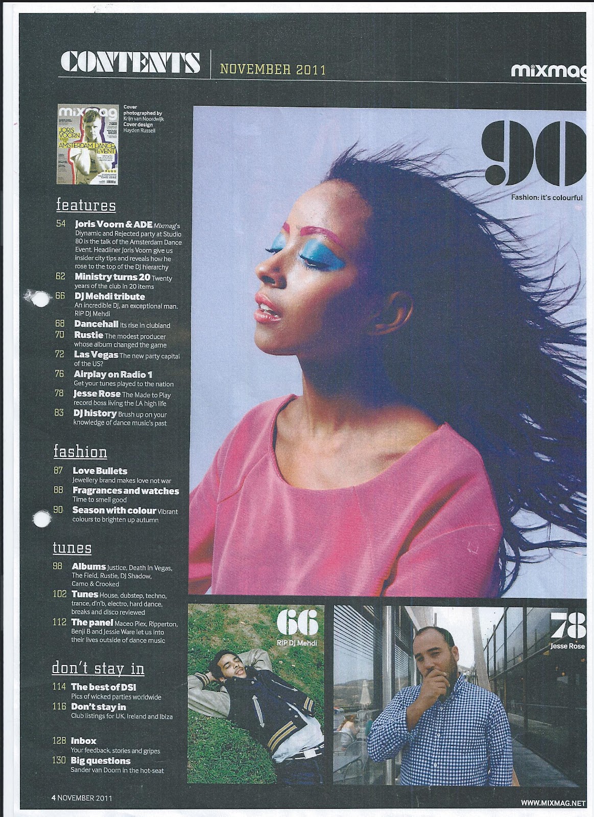
Similarly mixmag also uses 6 images which are spread over a double page. The images vary in size with a larger, dominating image on each page. The smaller images are all related to music and use fairly bright colours to attract the audience. The use of bright colours makes the images stand out ore against the darker background. The two main images use bright lighting to enhance the colours in the picture.
Similarly mixmag also uses 6 images which are spread over a double page. The images vary in size with a larger, dominating image on each page. The smaller images are all related to music and use fairly bright colours to attract the audience. The use of bright colours makes the images stand out ore against the darker background. The two main images use bright lighting to enhance the colours in the picture.
Other convention of the contents page includes the use of writing and organisation of text and headings on the page. ‘mixmag’ includes the most articles. Subheadings are used to separate the featurs into various sections. These include fashion, VIP, don’t stay in, tunes, features and your free CD. Underneath these headings are the listed articles which are indicated by page numbers. A brief caption is given to explain what each article is about. The articles are listed in a column form which makes them easy to read and also to find in the magazine. A white font is used to contrast with the darker, black background.
Top of the Pops magazine features 32 articles which are all suited to the target audience of young teenage girls interested in pop music. The articles are similarly separated into headings such as we love boys, we love shopping, wins and offers celebs and gossip and all about you. These topics are all related to the audience and are also organised under page numbers. Listing the articles is a clear way to organise the page and separating the various features into separate boxes makes finding the articles easier. A key is also used within the contents page to highlight the articles which are all related to boys. This similarly to mixmag, separates the various articles into the different topics.
Mojo magazine only features 7 articles however the descriptions underneath the subheadings are in a lot of depth. Again the page numbers are indicated however the articles are spread over 6-8 pages each showing they take up the majority of space within the magazine. They are all completely relevant to the music magazine. The articles are split into two sections one being named ‘features’ the other ‘cover story’. A bold black font and capital letters indicate the headings of the articles. A contrasting red font is used to highlight the subheadings of the topics.
Unlike the other magazines, NME’s contents page is dominated by pictures however some writing conventions are also used. The main 7 articles are accompanied by an image. This reinforces to the reader that these articles are the main ones in the magazine. Other smaller articles are presented in a list form and are in a smaller font. Each of the pictures are next to a large page number and a quote from the article they relate to. This is a really individual feature of the magazine and attracts the audience to read the articles. The organisation methods include the use of page numbers and subheadings which is common throughout all four magazines.
From this task I have learnt that individual features of a contents page stand out in magazines. Using quotes from the articles is a good way to attract the audience and give them a brief indication of the article and what it contains. Using relevant images also emphasise the topic of conversation in each feature.
I have also learnt that the colour scheme of the magazine is continued from the front cover to the contents page. This is a feature I will imitate in my own music magazine. Pictures can sometimes overwhelm the page and draw attraction away from the text therefore from this I have learnt that my magazine contents page shouldn’t include too many images as the purpose of the page is to inform, and give further information about the articles inside the magazine. I prefer the magazines which use a list form to show the articles in the magazines as they present a clearer image and the page layout looks neater making the text easier to read. I have also learnt that the subheading or topic of each article needs to be in a bolder of contrasting colour to make it stand out from the other conventions on the page.
This is excellent Victoria

No comments:
Post a Comment