Search This Blog

Wednesday, 2 May 2012

Front cover final

FINAL DRAFT OF FRONT COVER
After working on my front cover I decided to change the picture on my front cover as it didn't seem fitting for my magazine. This picture still dominated the page and I was able to surround the image with cover lines and other icons.
At first I cut the image out to have a white background however I felt similarly to my article this presented too much white space. I then decided to change the image to have it's existing background on the page. This was a darker grey colour which made the pink cover-lines stand out. However the shadows were then a problem.
At this stage of producing my magazine I decided to take some more pictures to try and solve the problems of the shadows and darker background. I produced a fourth draft of my magazine cover with a new image.


Final Contents Page

My final contents page differs slightly from the existing drafts. Before the image I used was quite bright and the dominant colour was black. I had also decided to use a black font for the text. This meant in some places the text was hard to read. To solve this issue I used Photoshop to edit the picture so the font was easily readable on top of the image. I used Photoshop to edit the colours. Other changes included changing the images at the bottom of the page. I decided to remove the image at the bottom left as I didn't think it matched the house style of the contents page. I kept the smaller image at the bottom right however had to change it as my front cover was constantly changing.

 FINAL CONTENTS PAGE -----

Tuesday, 1 May 2012

My final article


Because my article was featuring the 'cover star' I used the same model to make the article match the front cover. I used a question and answer interview article where the magazine company were asking the star questions about their career and future. After writing my article I transferred the text onto indesign to start creating my article. I designed a quick draft of my initial ideas for my article. Once I had transferred my text onto the indesign program I realised that only a few pictures would be needed to fill up the remaining space. I maintained the colour scheme of black and pink text which I had used on my front cover and contents page. I also used a grey background to make the text stand out and reduce the amount of 'white space' on the page. To include features of a magazine I used quotes from the article; in a larger font, amongst the text. This was a key feature as it separated large chunks of text. I also used shadows on the quotes to make them stand out and a main focus point on the page.     

My magazine drafts

2nd draft of front cover

   3rd draft of front cover 

Tuesday, 17 April 2012

Article drafts

FIRST DRAFT OF ARTICLE
           
     
SECOND DRAFT OF ARTICLE


Monday, 16 April 2012

Evaluation

What have you learnt about technologies from constructing your product?Looking back at your preliminary task, what have you learnt in the progression to your full product?


Sunday, 15 April 2012

Video run through of my completed magazine


This video is a run through of my magazine. However since filming the video I have made some minor changes to my contents page and article. My completed final versions can be found in my blog under final drafts. 

Interviewing my target audience

Interview three people who meet your target audiecne talking about whether or not they like your product.
As part of my evaluation I interviewed my target audience to receive feedback on my magazine.

Interviewee 1: Female, Age 13
By looking at the front cover of the magazine I think it would attract people of my age because the colours are bright and girly. The different shades of pink give the magazine a young, feminine approach. The cover lines on the front cover are good because they relate to the theme of the magazine which is pop music.
The contents page presents typical features of a magazines contents page this is because it features conventions such as page numbers and the titles of the stories/ articles included inside the magazine. I also like how each page looks as if it belongs to the same magazine due to the colours and interesting layout.

Interviewee 2: Female, Age 17
I really like how Victoria has linked her main colour themes black and pink to what the cover star is wearing, I also really like the name of the magazine 'Sensation' as the word sensations makes you feel as if your going to find out about lots of different topics throughout the magazine;music genres.You can tell that victoria has thought alot ablout her target audience, and how she is going to engage them, i think her colour choices were excellent as they really signified her audience is teenage girls. Her contents page is set out in an very organised way, which is very easy to read. I think the print screen of the front cover in the bottom right creates a funky edgey look to the magazine. Overall I really like the magazine and think it attracts the right audience.

Interviewee 3: Female, Age 15
From looking at the magazine I can tell the audience are teenage girls from the colours being used. The audience is also indicated through the 'free poster' being included which you wouldn't necessarily have in an adult magazine. The audience is also presented via the various cover-lines such as 'Top 100 dance tunes of 2012'. This shows the magazine is focused around pop music and targeted at a younger audience. From looking at the contents page I can tell this is the purpose due to the layout and the clear indication of page numbers. The continuation of pink shows the audience are young and gives the audience a clear indication to where the key information starts.
Looking lastly at the article page, the model looks like she is having fun in the images. I like the alterante colouring of the text this makes it easy to understand who is speaking at which time. (Alteration between the interviewer and interviewee). The page is set out to look young, fun and fashionable. I really like the magazine it definitely approaches the correct target audience of young female teenagers.

Evaluation

How does your media product represent social groups slideshareThis slidshare presentation shows how my media product represents social groups./ How did you address/attract your target audience? 

Tuesday, 27 March 2012

Evaluation

In what ways does your media  product use, develop or challenge forms and conventions of real media products?
What kind of media institution might distribute your product and why?


Other images

Other images I used included a bar code which I was able to make on powerpoint and transfer across to indesign. I made the barcode by using black lines which varied in thickness. I also used numbers to make the bar code. I imitated this feature from an actual bar code therefore when creating my own it was easier as I had a brief indication of what a bar code looked like.
I also made a plus symbol to accompany the word 'plus'. This was another feature which i made using lines and a shadow on indesign.
                                            

Photoshoot

When taking the photos for my magazine I used a range of angles and camera shots to vary the images in my magazine. By exploring the camera angles the pictures looked more attractive and fitting to my genre of magazine. I experimenting by placing my model in different poses. To create a range of pictures I also used various angles such as close ups, long shots, wide shot, high and low angles.
I didn't use that many props for my photoshoot as I wanted the model to be the main focus of the images and dominant the page in the magazine.

Thursday, 1 March 2012

Contents page

Similarly to my front cover I completed the first draft of my contents page. Again I used images I had taken myself and edited them using Adobe Photoshop. I really liked the main image I have used so decided to make it the dominant focus on my contents page. I had a few problems when creating the page. The writing is in a black font which doesn't stand out majorly from the background image. However the major focus', such as the page numbers are in a brighter colour therefore stand out. The text on the page is readable as I altered the colouring in the background and the positioning of the text. I maintained the fonts I had used on my front cover. This is an essential part of creating my media piece, all of the individual pages must look like they come from the same magazine.A target could be to work on the house style of my magazine pages.

Thursday, 23 February 2012

Analysing articles

ANALYSIS
The final section I will need to create for my magazine is the double spread article. As part of my research I have looked at various articles from different magazine genres.
I have decided for my article I am going to use a question and answer style. This is because I feel it is better suited to my target audience. Teenagers would loose interest in a long winded article therefore by quickly introducing new topics via continuous questions I feel I could maintain the audience's interest and write in an appropriate tone. The articles I looked at all use images to break up large chunks of text. This is a feature I am planning to imitate in my own magazine. By using large images you can create further understanding with the reader and give a brief indication about the article and its content.
I mainly looked at the layout, tone and sentence structure of the articles. Using humour is a good way to interest the audience. 'WE GRILL SAM GRILL' uses this feature as well as emphasising points through exaggeration.
The layout plays a largely important role of the article. Large chunks of text are unattractive therefore by breaking the questions down into topics the audience can not only skip to the section they are most interested in but also pin point information about the article.
By looking at the featured articles, the use of complex sentences are more often used in articles aimed at an older audience. This is because an older age range would have advanced literate knowledge and understanding. This sentence structure would not be appropriate for my magazine article as my target audience are young teenagers. Therefore by using declarative and simple sentences I will attract the right target audience.


Sunday, 19 February 2012

Front cover draft

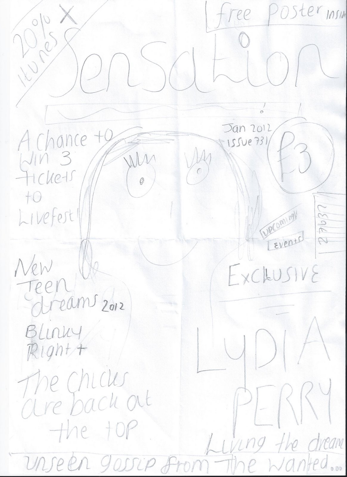
Using my hand-drawn plan for my magazine I started working on my computerized first draft. Using programs such as Photoshop and Adobe indesign I was able to play around with different features to edit images I had taken in my photoshoot. After deciding on a main image for the front cover I was able to place other content around the image. Adobe indesign enables me to layer content and place the features in a certain way. I am also able to lock and save certain features making the process of my magazine easier.

Front cover draft


Posted by PicasaI have started to jot down some initial ideas for my front cover. I done this by studying other magazine covers and using their layout to design my own cover. This image shows the ideas for my cover.
I have included captions and headlines, a price and bar code as some of the features of my magazine. 

Codes and Conventions contents pages essay


Codes and Conventions of a contents page
Victoria Perry
The four contents pages can be analysed by looking at individual codes and conventions these include the pictures, writing and general organisation of the page. Looking at ‘Top of the Pops’, ‘Mojo’, ‘NME’ and ‘mixmag’ all of the magazines use these features in different ways.

The magazines all use a different number of pictures. With Mojo magazine, the contents page is dominated by one main image on the right hand side. The image is in black and white which could represent the magazine relates to modern day bands but also bands from the past. The black and white enhances this message. The camera angle used is a mid shot this allows the reader to notice the guitar in the icon’s hand, again highlighting to the audience the magazine is of a music genre. However, compared to Mojo, NME magazine uses 8 images on a single page. All of the images vary in camera angle and the use of lighting differs. Close up’s are used to show the artist in the pictures facial expressions in more detail. Mid shots and low angle shots are also used for the left hand side pictures which are taken at a concert. Some pictures are styled and arranged and then the image is taken however the darker pictures look as if they are from a concert therefore aren’t staged and are natural. This could indicate the magazine features a lot of information about gigs or concerts.  An advert or poster like image is featured on the contents page. This image is in red and uses a bright yellow font which stands out from the text and other images. The image is advertising the subscription to the magazine therefore contrasts the plain white background and other darker colours used on the page. All of the pictures are in colour which brightens the contents page and gives the reader more visual content. Top of the Pops magazine uses 6 images which all vary in size. There is one main image in the top left hand corner of the page which is annotated with large page numbers and arrows. This is a unique features and a main visual point of the contents page. The colours used, pink, yellow and white are also bright and match the colour scheme of the whole contents page and magazine in general.  All the pictures are taken from a straight-on camera movement. This equally shows the images in detail.
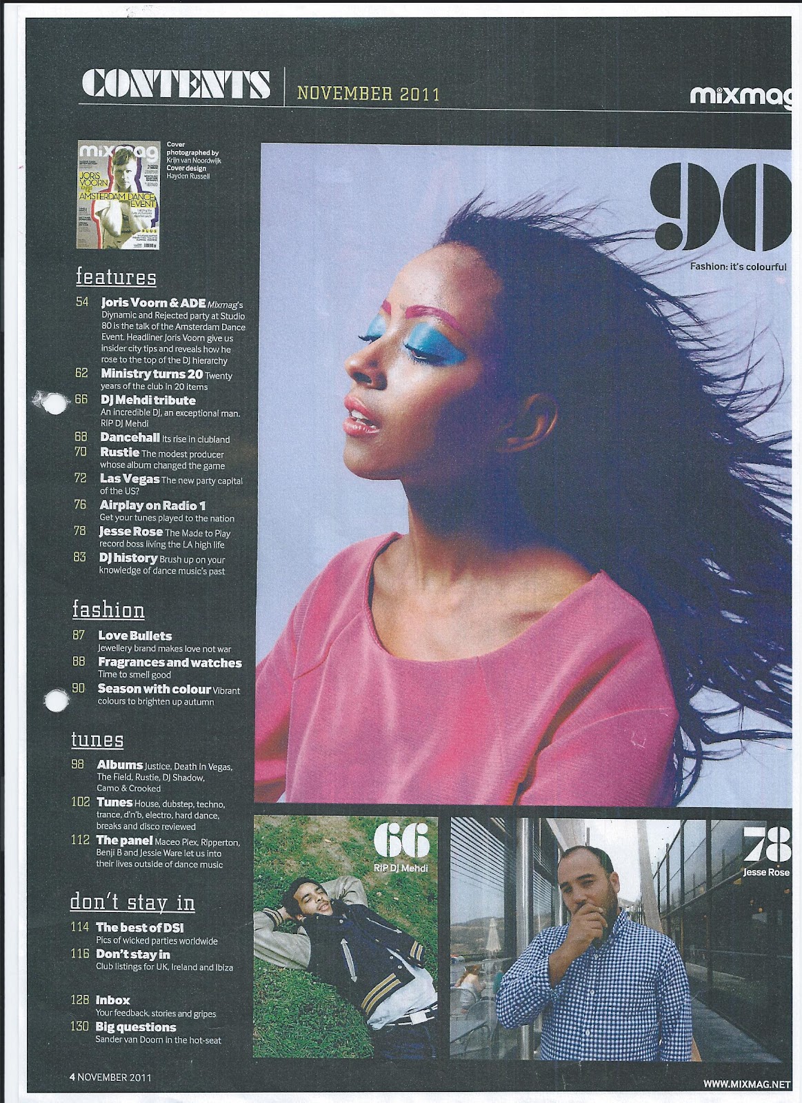
Similarly mixmag also uses 6 images which are spread over a double page. The images vary in size with a larger, dominating image on each page. The smaller images are all related to music and use fairly bright colours to attract the audience. The use of bright colours makes the images stand out ore against the darker background. The two main images use bright lighting to enhance the colours in the picture.

Other convention of the contents page includes the use of writing and organisation of text and headings on the page. ‘mixmag’ includes the most articles. Subheadings are used to separate the featurs into various sections. These include fashion, VIP, don’t stay in, tunes, features and your free CD. Underneath these headings are the listed articles which are indicated by page numbers. A brief caption is given to explain what each article is about. The articles are listed in a column form which makes them easy to read and also to find in the magazine. A white font is used to contrast with the darker, black background.
Top of the Pops magazine features 32 articles which are all suited to the target audience of young teenage girls interested in pop music. The articles are similarly separated into headings such as we love boys, we love shopping, wins and offers celebs and gossip and all about you. These topics are all related to the audience and are also organised under page numbers. Listing the articles is a clear way to organise the page and separating the various features into separate boxes makes finding the articles easier. A key is also used within the contents page to highlight the articles which are all related to boys. This similarly to mixmag, separates the various articles into the different topics.
  Mojo magazine only features 7 articles however the descriptions underneath the subheadings are in a lot of depth. Again the page numbers are indicated however the articles are spread over 6-8 pages each showing they take up the majority of space within the magazine. They are all completely relevant to the music magazine. The articles are split into two sections one being named ‘features’ the other ‘cover story’.  A bold black font and capital letters indicate the headings of the articles. A contrasting red font is used to highlight the subheadings of the topics.
Unlike the other magazines, NME’s contents page is dominated by pictures however some writing conventions are also used. The main 7 articles are accompanied by an image. This reinforces to the reader that these articles are the main ones in the magazine. Other smaller articles are presented in a list form and are in a smaller font. Each of the pictures are next to a large page number and a quote from the article they relate to. This is a really individual feature of the magazine and attracts the audience to read the articles. The organisation methods include the use of page numbers and subheadings which is common throughout all four magazines.

From this task I have learnt that individual features of a contents page stand out in magazines. Using quotes from the articles is a good way to attract the audience and give them a brief indication of the article and what it contains. Using relevant images also emphasise the topic of conversation in each feature.
I have also learnt that the colour scheme of the magazine is continued from the front cover to the contents page. This is a feature I will imitate in my own music magazine. Pictures can sometimes overwhelm the page and draw attraction away from the text therefore from this I have learnt that my magazine contents page shouldn’t include too many images as the purpose of the page is to inform, and give further information about the articles inside the magazine. I prefer the magazines which use a list form to show the articles in the magazines as they present a clearer image and the page layout looks neater making the text easier to read. I have also learnt that the subheading or topic of each article needs to be in a bolder of contrasting colour to make it stand out from the other conventions on the page.

This is excellent Victoria – really detailed and thorough. This will help ensure your own contents page is well suited to your magazine.  

Wednesday, 1 February 2012

Peer assessment

From my peer assessment it was advised that I included more images to my blog to increase the visual interest and have some breaks from the large chunks of text. This is something i'm going to work on in the future and when appropriate, include more relevant images.
Another improvement I was given was to include more socially friendly apps to make the blog more appealing and take advantage of the blogging apps. This is something I was interested in and thought it was a good way to adapt my blog to make it more fun and friendly, therefore I added some blogger 'gadgets' and apps to not only maintain interest in my blog but also make the viewer feel more welcome. I added a recent comment section as well as a search box and small welcome message.
The peer assessment showed that the good qualities of my blog were the detail in my text and easy to read layout. The assessor also commented on the fact I had regularly updated my blog. 
As part of the task I had to assess the blog of someone in my class. I thought this was useful as I was able to see how other people had decided to layout their blog and what features they had included. I similarly suggested improvements the blogger could make to their work, but also brought to attention the positive aspects of their blog. 

Saturday, 28 January 2012

Planning my magazine

After looking at a series of music magazines it is time to start planning my own magazine. I drew a rough plan of my original ideas on paper however I was just experimenting with the layout, nothing is final.  We started to experiment with programs such as Adobe indesign and Adobe photoshop. Using the pictures we had taken in the practice photoshoot we were able to edit them and place them in different ways using the programs. Adobe indesign also allowed me to play around with different texts and background colours. This task was useful as I now have a brief understanding of how the program works and the different ways I could lay-out my magazine.
I also then started planning what I would include inside my magazine. I done this by drafting ideas for cover lines and interesting features that I could include.
Some of my ideas:
- Interview with cover star.
- Latest celebrity/ music artist gossip.

- Exclusive feature
- Upcoming events
- Music review
- Persuasive features. (Free music download or poster).

To help get varied feedback for our individual blogs and previous work we each had to analyse someone else's blog and fill out a feedback sheet allowing them advice on improvements they could make to their blog. Some of the questions included h
ow regularly have they updated their blog and how could they improve their blog in the future. We also had to analyse the best thing about their blog. 

Thursday, 19 January 2012

Codes and Conventions essay

We looked into further detail at the conventions of music magazines belonging to various genres. The four magazines I analysed were Drummer, mixmag, Vive Le Rock and Terrorizer. Belong is my analysis of the magazines. 


Analyse the Codes and Conventions of four music magazine covers.
Victoria Perry
From studying mixmag, Drummer, Vive Le Rock and Terrorizer I have been able to analyse the various conventions and features of a music magazine.
The first comparison I made was comparing the technical aspects of the four magazines.
The first magazine mixmag is a dance and clubbing magazine targeted towards older teens that are able to go to clubs. The magazine uses one main image of a young man, supposedly a DJ. The camera angle is a straight on mid-shot. This enables the audience to see the image in more detail and look further at the boy’s appearance and the colours used. The image also presents the DJ as he would be in a club. He is stood confidently, but relaxed and in some ways this is how he would be stood behind the decks at a club[r1] .
The colours around the main image are a mix of red, purple, yellow and lighter versions of purple and red. This indicates the magazine title being ‘mixmag’. I also think that because the magazine is aimed at people who go to clubs and are into dance music the blur of colours symbolises the loud music and mix of sounds and lighting that you would be familiar with inside a club. The colours are bright and bold and stand out from the plain grey background. This again represents the club itself with a dark atmosphere and the only source of lighting the bright strobe lights.
The ripped off corner of the magazine cover shows similarities to that of a flyer. Flyers are usually to inform and advertise an event. The front of the magazine cover says ‘AMSTERDAM DANCE EVENT’. Therefore the ripped corner affect may be to represent the advertising side of the magazine
[r2] .

In comparison the magazine Vive Le Rock has different technical aspects. Compared to ‘mixmag’, Vive Le Rock uses a high angle shot to capture the seven featured people on the cover. The high angle shot also allows the audience to understand the dress sense of the characters and their individual images, it also gives a sense of power to the audience as the reader is looking down on the image of the band. Due to the image being in black and white you cannot analyse the lighting of the magazine cover. The whole magazine is framed by a thick, black border. I think this is used to generate a better understanding of the genre of the magazine being punk and rock ‘n’ roll. It also gives a sense that the magazine contains everything you need to know about the band and the featured articles.

The third magazine I compared for technical aspects was Drummer. This magazine has a specific audience of people interested in drumming. The image used is at a slight low angle. This could show the power and profession of the drummer featured on the front cover compared to the reader. This particular angle also shows what the drummer is wearing and the fact he is positioned behind a drum set. The lighting is mainly on the drummer’s face which in depth shows his facial expression[r3] .
This magazine also features another smaller image on the right hand side. The image is very small and is framed by a thin white line that joins to make a square box. The image itself is dark and the main focus is the hands of the man. This image shows the dark side to the magazine.

The final magazine I compared was Terrorizer. The magazine cover used one main picture of a band member and then 3 smaller images positioned both at the top of the magazine page and to the left hand side. The main image dominates the page and due to the straight on close up the image is shown in great detail. The main image is dark and due to the clothing of the man in the image everything seems like a black silhouette. The surrounding colours are contrasting due to the light greys. This makes the main image more appealing to the audience as in a way it seems as if the artist is peering out of the page. This image is framed by text and cover lines which again highlights that the main image is the most important feature of the magazine. Similarly to Drummer magazine the main source of lighting is on the face of the artist. This shows the facial expression and facial features in more detail.

From analysing the technical features of the four magazines I have learnt that when one image dominants[r4]  the page, usually the lighting is on their face to highlight their facial expressions in more depth. This is a feature I could imitate on my own magazine. I have also pinpointed that the magazines usually use alternate colours for the cover lines and head line to show a contrast from the image. If smaller images are used they usually surround the main image and are in another colour to highlight them or if not they blend in with the surrounding background. These features I have analysed could be important when designing and creating my own magazine.

The next focus point of the four magazines was the symbolic view points. Each of the four magazines used this convention differently.
Mixmag positioned the main image to symbolise his position of a DJ. By placing his arms around his neck, this showed how usually a set of headphones would be in place, which emphasises the genre of the magazine to be dance music. The clothes that the DJ is wearing are relaxed and stereotypical of a DJ. The plain background and clothing used on the DJ show how the DJ is relaxed and chilled back. The music speaks for him and his personality. From this I learnt that attention to detail can play an important role in emphasising the genre of my magazine.

 For the Vive Le Rock magazine many symbolic qualities are used. The magazine uses one main image which is stretched across the whole magazine cover. The image is in black and white which could indicate the band is old fashioned. The band members are dressed in clothing typical of the 60s era. The use of black and white could reinforce this by showing the underlying message. The black and white image makes the red text stand out more. This could show that the image isn’t as significant as the text and cover lines. From this I have learnt that even though a image plays a largely important role when creating a magazine cover, sometimes the cover lines are equally important therefore when designing my own magazine I need to pay attention to the image and text[r5] .

The next magazine, ‘Drummer’ uses a dominating image as the main focus point. However the image varies as some parts are in focus whilst other parts such as the drum sticks appear blurry. This could indicate the main genre of the magazine is drumming however the magazine also features other articles which are of larger interest to the reader. The use of the drum sticks reinforces the point of the magazine. The picture of the drummer is covered in various areas by text, similarly to Vive Le Rock magazine this could indicate the importance of the inside content over the image.
The body language of the drummer in the main image is relaxed and his facial expression is fairly relaxed and kind looking. The magazine also features 12 pages of tuition about drumming, therefore the expression of the drummer could show that the magazine allows you to learn new tracks and drum pieces at your own pace in a relaxed style
[r6] . A cross or plus symbol is used a numerous amount of times towards the bottom of the magazine cover. This could indicate that there is ongoing exciting content that is never ending.

Terrorizer is written in a font that uses a jagged and rocky edging. This is a clear indication that the magazine genre is Rock. The use of a dark blue and grey house style gives a sense of mystery. This could indicate more about the magazine itself. The background of the magazine cover is similar to a sky setting. The blend of blue, grey and white represents a sky showing the magazine could be out of this world with new information and articles that haven’t been released anywhere else. Towards the bottom left hand corner of the magazine, lists of bands are separated by small, brown skull symbols. Again this is reinforcing the genre of the magazine to the audience. The colour brown is contrasting to the black, blues and whites used.

The last convention I analysed was the written aspects of the magazine covers.
With mixmag, the use of mix in the magazine name indicates what the magazine is about. DJ’s mix discs and the magazine is focusing on dance music. The biggest cover line on the magazine is about a dance event in Amsterdam again this is reinforcing the purpose of the magazine which is allowing people information about upcoming events to do with clubbing and dancing
[r7] . The magazine uses a persistent theme of both capital letters and lower case letters. For the main cover lines capital letters are used to make the information stand out more. The smaller details are in lower case. Small tricks are used to show the humour of the magazine. Again as the main feature of the magazine is about the Amsterdam event other written elements reinforce this such as ‘Dutch courage’. This is presenting alcohol which links into clubbing. Superlatives are used as a persuasive technique. Worlds such as ‘biggest’ show that this magazine is bigger and better than other magazines in the dance genre, therefore the reader will be persuaded to buy it. Personal pronouns are also used to make the magazine more attractive to the reader and seem as if it is personally approaching the target audience.

The written elements of Vive Le Rock include persuasive techniques such as ‘Free CD’ This persuades the reader to buy the magazine as even though the cost of the CD is probably included within total magazine cost, the reader still believes they are getting a good deal.
The use of ‘exclusive’ also makes the magazine stand out from others as the reader will be easily persuaded as again like the free CD attraction, the reader thinks they are getting something special or a ‘one-off’ included.
Another written feature I analysed was the use of an outline of the words ‘2-TONE PAST’. No other text on the page apart from the title uses a thick outline. This reinforces the ‘2’ as the text is bolder. The use of red also emphasises the genre as stereotypically red and black are the colours of rock ‘n’ roll.

Drummer constantly uses capital letters within the headlines and cover lines. The text is also written in white to stand out against the darker background. The only writing in a different colour are the words ‘THE UK’S BEST VALUE’. This is a similar persuasive technique to the other magazines as it uses a comparative. ‘Best’ makes Drummer magazine stand out from the other magazines in this genre.
Terrorizer uses the same persuasive techniques by using words such as ‘exclusive’ and ‘unreleased’ which have the same result on the audience.

Overall by studying ‘mixmag’, ‘Drummer’, ‘Vive Le Rock’ and ‘Terrorizer’ I have analysed the technical, symbolic and written codes and conventions.
From this task I have learnt that these conventions play a major role in the creation of a music magazine. Underlined messages can be extracted from various symbolic features. The written conventions also have a large role in persuading your audience to buy your magazine which is one of the main factors I need to consider when designing my magazine.
I have also learnt that colours, icons and captions need more attention than I originally thought.
The genre of the magazine needs to be clearly portrayed from first glance and the magazine and this can be emphasises through these three conventions.

Well done Vicky – you have analysed the covers in detail and thought really hard about why they have been created in that way. You have clearly learnt a lot about how to create your own cover and you will be able to think about the effect of all these codes and conventions on the reader.

 [r1]Good – you are linking the picture to the genre of the magazine.
 [r2]Really good depth of detail here – well done.
 [r3]Why do you think this was done?
 [r4]dominates
 [r5]Definitely – both are important.
 [r6]Nice idea.
 [r7]Yes – make sure your main coverline is closely linked to the ethos of your magazine.


Overall by studying ‘mixmag’, ‘Drummer’, ‘Vive Le Rock’ and ‘Terrorizer’ I have analysed the technical, symbolic and written codes and conventions.
From this task I have learnt that these conventions play a major role in the creation of a music magazine. Underlined messages can be extracted from various symbolic features. The written conventions also have a large role in persuading your audience to buy your magazine which is one of the main factors I need to consider when designing my magazine.
I have also learnt that colours, icons and captions need more attention than I originally thought.
The genre of the magazine needs to be clearly portrayed from first glance and the magazine and this can be emphasises through these three conventions.